I was listening to Lynda.com’s training course DevOps Foundations: Monitoring and Observability with Ernest Mueller and Peco Karayanev. I thought I heard Mr. Mueller say that Google had a a trinity of metrics which they always cover when developing Web APIs: Throughput, Response Time, and Error Rate. He stressed that it’s important to look at all of these indicators on the same dashboard, because they create a more informed view when displayed together. I did a quick search and it didn’t really pop-up on a google site, but what Mueller said was pretty much described on New Relic’s Application Monitoring page.
One thing that made a lot of sense to me was how these three metrics are strong indicators of when a major outage is going to happen. If the response times go up but everything else is the same, then a downstream system (like a database) is probably having an issue. If the throughput drops but the response times don’t then a system earlier in the workflow is probably having an issue. And, a ton of errors is a ton of errors in the web api.
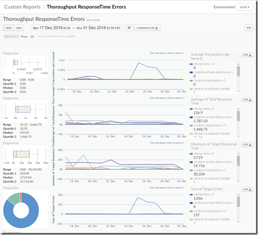
So, I wanted to know how difficult it would be to create a report in Apigee which could visualize all three of these metrics on the same screen.
To do this, I created a Custom Report in the Analyze section of the Edge Admin portal and setup these metrics:
- Average Transactions per Second
This should be your throughput. One thing that Mueller and Karayanev said was that you shouldn’t look at averaged metrics in isolation. If you monitor an average for a particular metric, you should also have a Max or Min of the same metric. That way you don’t see misleading information where the average number of transactions look normal, but that is actually hiding spikes in traffic. Unfortunately, there was no pre-built metric for Sum of Transactions per Second. - Total Response Time (Average) and Total Response Time (Max)
Following the guidance from above (don’t look at average metrics in isolation), both of these metrics combine to show a solid view of the real response times. - Target Errors (Sum)
The system also has Proxy Errors and Policy Errors. I chose to go with Target Errors, because they are the errors that should indicate if the actual Web API was having problems. - Filter
I also used a filter at the end to remove two things that could corrupt the data:
1) The dining-cams proxy is a streaming proxy and never closes it’s connection. So, the average response time is always the maximum value the graph will hold.
2) In an early post I talked about using a /upcheck endpoint to ensure proxies were up and running. I needed to remove those requests so the data wouldn’t be skewed by synthetic calls.
Overall, it looked like this:
We have very few users of the system, so there wasn’t much data to actually show. But, it did provide a few pieces of good information:
- The Registrations endpoint is pretty sluggish.
- The private endpoints are expected to take a long time (those response times are actually kind of fast)
- The Dining Menu endpoint could have it’s error logs looked over.


0 comments:
Post a Comment